THE VERIFICATION LAYER FOR COMMERCECHECKED DAILY · OCTOBER 22, 2026
Product.ai/Research/The first time I designed a logo with AI, axioms, and my own creativity.
Practitioner Account
The first time I designed a logo with AI, axioms, and my own creativity.
DG
David Guzman
Creative Director
Published: October 22, 2026
Late last year, Michael Quoc, the CEO of Product.ai, rolled out axiomatic intelligence, a new way of combining the outputs of multiple Large Language Models (LLMs) to find answers to important questions grounded in truth and scientific consensus.
I was one of the first people he shared it with, and my first reaction as a Creative Director was confusion. It sounded like something built for scientists and engineers, not designers.
And, just as I was trying to wrap my head around it, Mike also announced that we would be rebranding from Demand.io to Product.ai and becoming an AI-native brand.
But, after thinking it through, I realized that I had an opportunity to try something nobody has tried before that would also show me a lot about the new Product.ai's flagship solution.
I decided to use axiomatic intelligence to help me research and make decisions about the rebrand, starting with the logo, and hopefully move faster than I could on my own.
Basically, I used axioms to build the logo for a company that builds axioms. At the time it felt very meta. Looking back, it seems obvious. It was also shockingly effective.
We kicked off the project on January 6, locked down the new brand identity on February 9, and launched the brand site on February 17. The work took only 42 days and delivered high-quality, award-winning results. The logo came first, and everything else in the brand grew out of it, which is why this is mostly a story about a logo.
What traditional brand development looks like
Anyone who's ever worked on a creative or brand team knows that traditional brand development typically takes at least six months to a year or more and costs hundreds of thousands of dollars.
This is because isolating what makes a brand unique and capturing that in visuals that are immediately legible to anyone is hard.
In most cases, it involves a long research and discovery phase, multiple rounds of review with stakeholders, and coordinating across a brand team and one or more external agencies. You might easily build three, five, or even more brand identities, each one requiring multiple mood boards, spec designs and logo treatments.
There's a more basic habit underneath all that, too. Brands and logos usually get built from the target market and a vibe. Sometimes you make something that looks good and fits, and you tie the story to it afterward. I wanted to go the other way. Break the problem down to the physics and make a logo that was inevitable, tied so tightly to what the company does that it couldn't be anything else.
I was initially skeptical that axiomatic intelligence could help me accelerate this process. But I was intrigued, and decided to give it a try.
Phase 01: I started with a simple brief
My brief for the rebrand was deceptively simple. Here it is word for word:
Build a brand for something you can't see, can't touch, can't photograph.
Truth.
Easy, right?
At first glance, this directive could lend itself to one of thousands of conceptual, abstract approaches.
Mapping the challenge
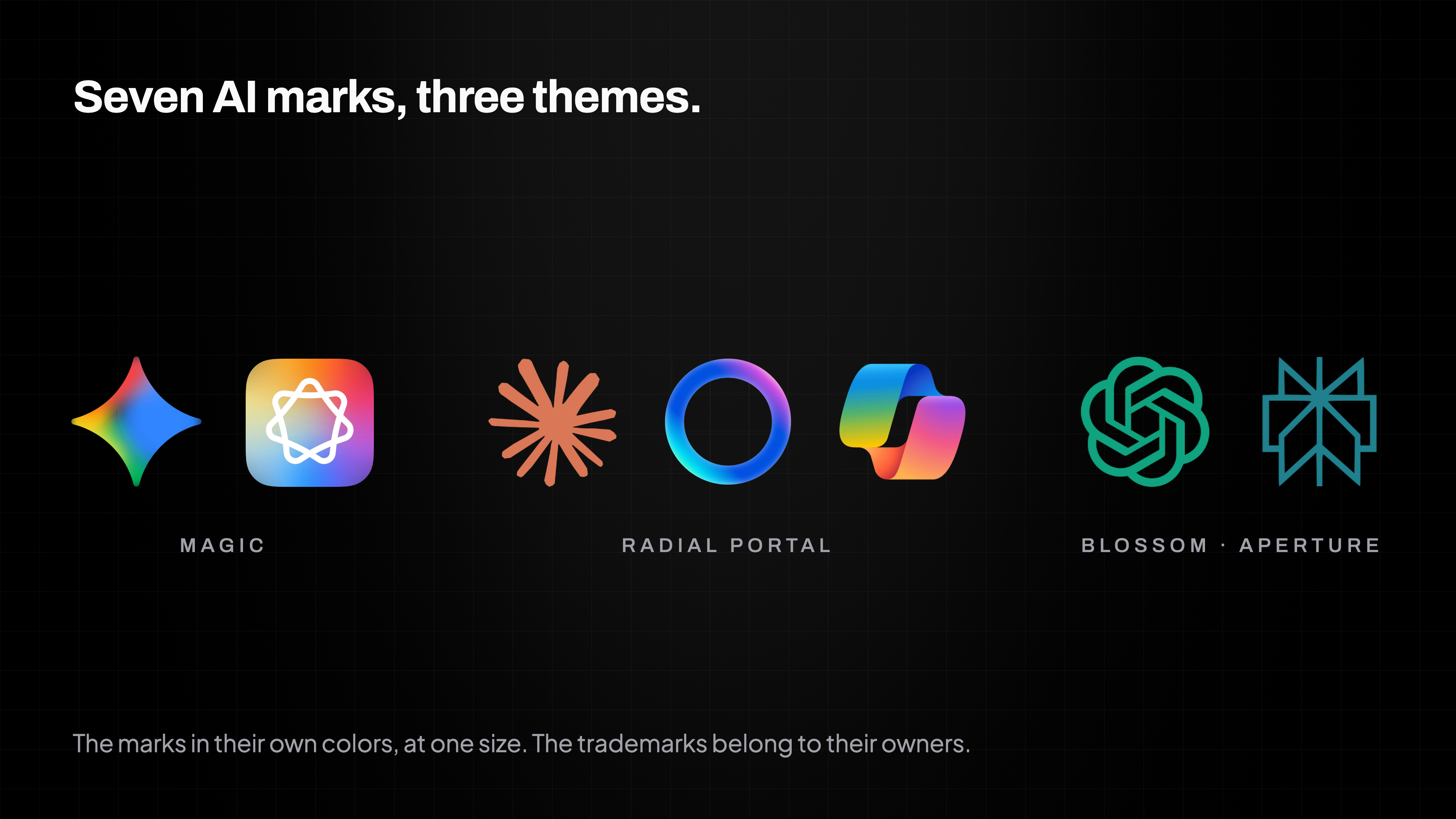
Our goal was a brand that embodied what we do and stood as a counter to everything already out there. So the first thing I did was take a closer look at the top AI labs' brands. They were all wrestling with the same problem I was. How do you visualize intelligence without a body?
I put their marks side by side, and they had all made the same choices. Magic sparkles, gradients, portals and blossoms. All of them metaphors for consciousness, meant to feel generative, magical and alive.
Seven AI marks, at one size, fall into three broad themes.
But Product.ai isn't any of those things the generative AI labs aspire to. We don't generate, we verify. And we don't dream, we prove.
So I knew we would need a different and distinctive approach.
Defining the problem
The next thing I did was to build a problem space in which I quickly scribbled down everything I knew about the logo and the color.
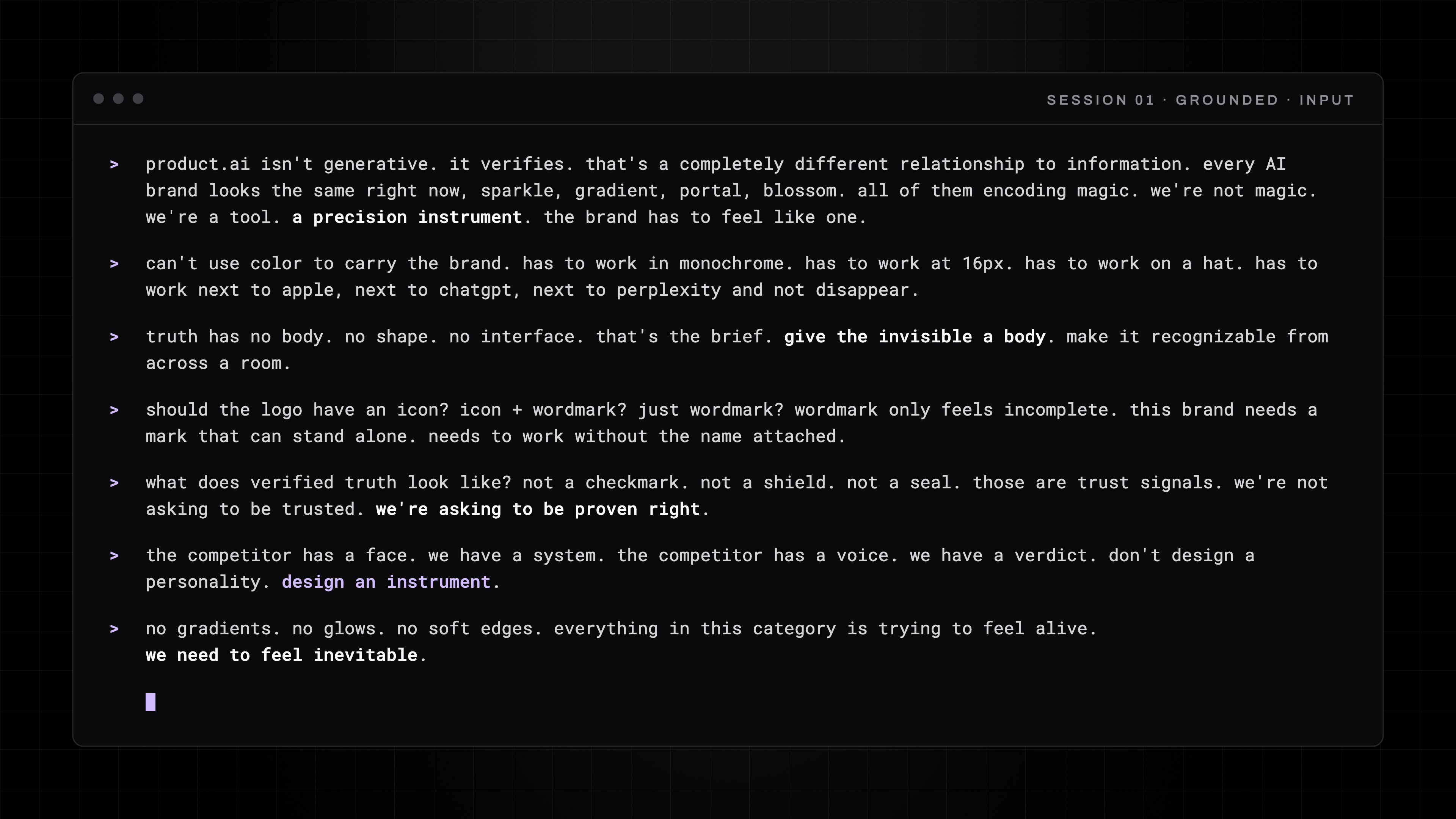
It wasn't pretty and it wasn't organized. It was a stream of consciousness, a bit like a therapy session. My concerns, what I was trying to achieve, the unknowns, all of it rough and unfiltered. This is what it looked like.
My problem space, typed into the grounded session before any sketching: what the brand is not, what the mark must accomplish, and what verified truth looks like.
It looked rough, but it gave me the context I needed. A clean brief would have gotten me a clean answer that solved nothing. The mess gave me a rough rock I could polish.
Phase 02: I used axiomatic intelligence to research from two POVs.
This is where axiomatic intelligence came in. Axiomatic intelligence is our technique for thoroughly researching a topic from multiple angles, reconciling the differences, and distilling evidence-based answers.
Research from two distinct POVs
I started by running two research sessions on the same problem, each starting from a different point of view, and I didn't let them talk to each other.
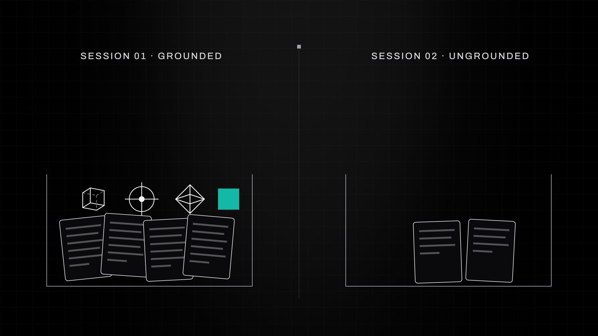
The first session was grounded. I gave it everything I knew, including Product.ai's positioning, our core documents, the competitive landscape and our design system. I also gave it my hypotheses about the logo: Maybe a cube, because we hold the truth. Maybe a reticle, because we find it. Maybe a diamond, because we forge it.
The second session was ungrounded. It got our technical architecture and a description of what we do as a company, and nothing else. No creative direction, no aesthetic preferences, no hypotheses. It didn't even know I was a designer.
Why run two sessions
The goal of running two sessions with wildly different amounts of grounding was to make sure I got back a wide range of options. Same problem, opposite inputs, and the two never talked to each other.
Two research sessions on one brief. The grounded one received everything I knew, my three logo hypotheses among it; the ungrounded one received two documents and nothing else. They never spoke.
Phase 03: Axiomatic intelligence built useful advice from conflicting results.
Axioms are hypotheses that have been tested by adversarial research. Each one is mapped to the sources that support it and given a confidence score, and they represent answers that are steeped in the relevant science, from behavioral science to design theory.
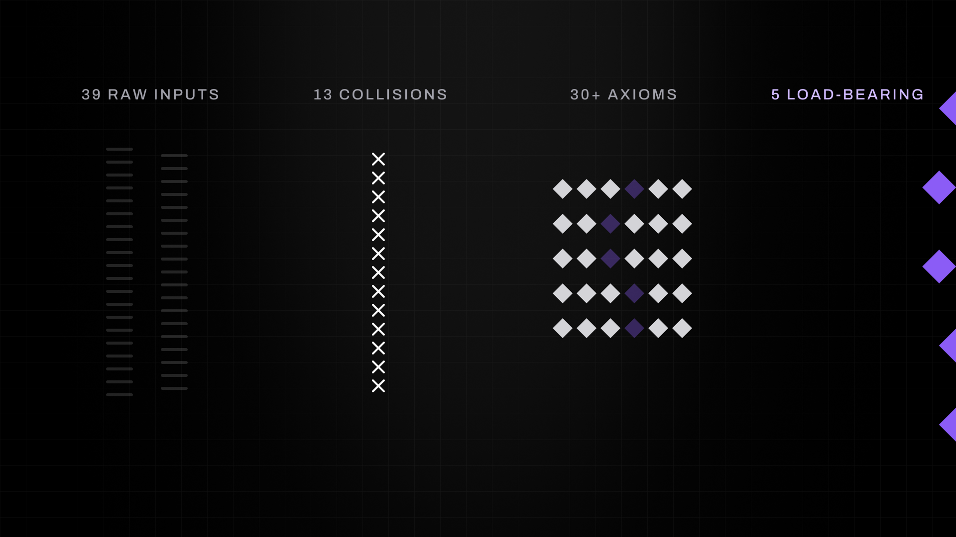
Out of those two sessions I received 39 raw inputs. Those inputs produced 13 adversarial collisions, the places where the two sessions disagreed or reinforced each other from different directions. The collisions forged more than 30 axioms, and five of them held up the entire logo. Four of them defined the form. The fifth, which I'll get to once we have the form, told me what the form had to do.
Thirty-nine raw inputs from the two sessions met in thirteen collisions. Thirty axioms came out of them, and five were most relevant to the logo.
Axiom 1: Differentiation through systematic inversion
This axiom said that every visual choice the leaders in the AI category were making was wrong for us. Every single one.
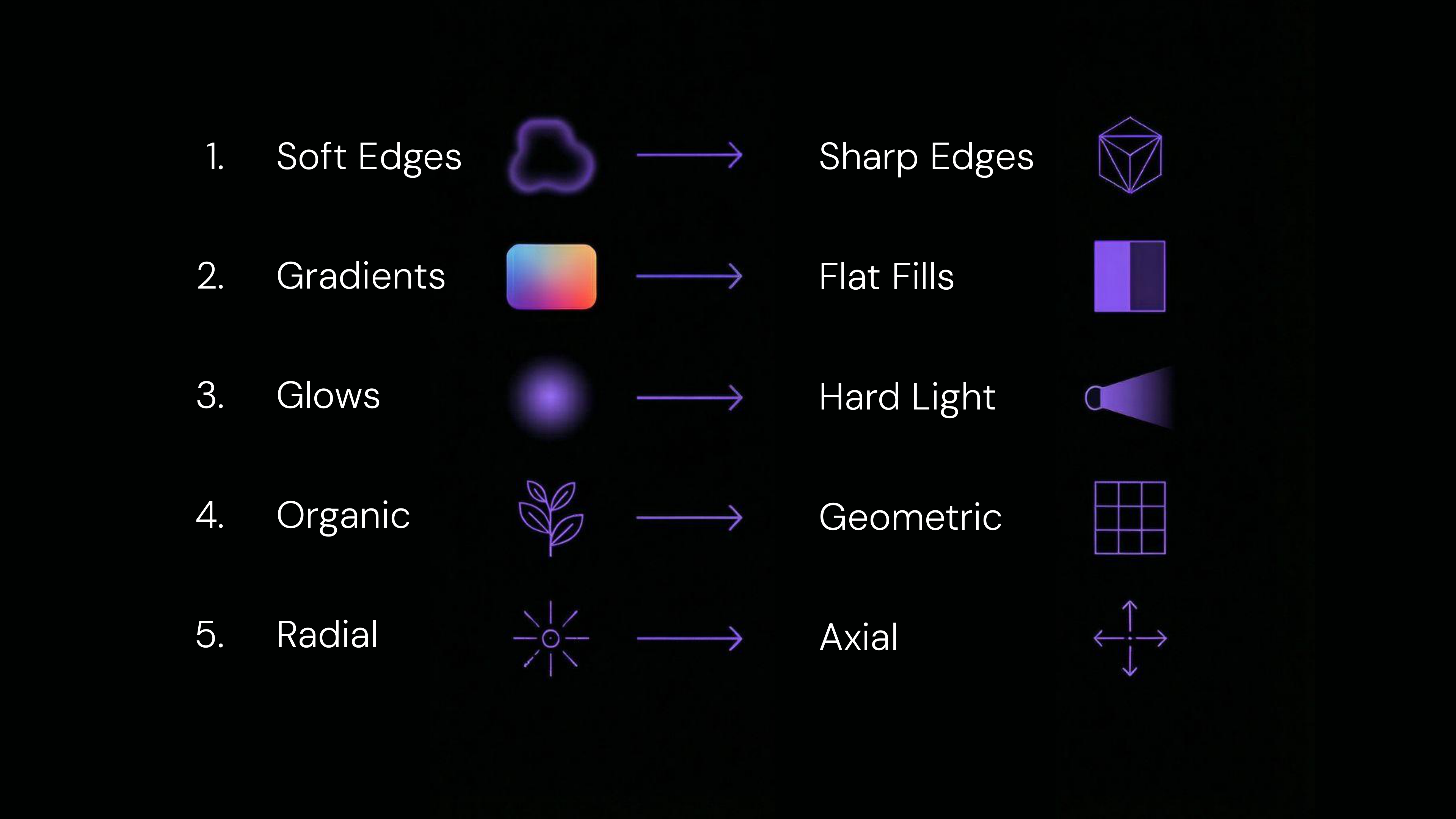
So I didn't look for inspiration inside the category. I looked at what everyone else was doing and did the opposite. Soft edges became sharp edges. Gradients became flat fills. Glows became hard light. Organic became geometric. Radial became axial. You get the idea.
Slide 68 from my Golden Hour 003 keynote: five habits of the AI category and their inversions. Soft edges become sharp edges, gradients become flat fills, glows become hard light, organic becomes geometric, and radial becomes axial.
Axiom 2: The mark must be an instrument
This axiom was based on how our brains process a logo the instant we see it. In as little as fifty milliseconds, we decide if something is a living thing or a tool. And living things typically have a personality that can quickly evoke an emotional response.
Because Product.ai is an instrument, this axiom stated that the logo itself should look like a tool, rather than something organic, so people would categorize it correctly at first glance.
Intuitively and creatively, this approach felt right to me.
Axiom 3: Truth is forged, not found
This axiom is about what Product.ai the brand is and, just as important, what it isn't. It emphasized that Product.ai is a mechanism for building truth by applying adversarial pressure to disconnected and sometimes conflicting information, distilling truth rather than finding or discovering it.
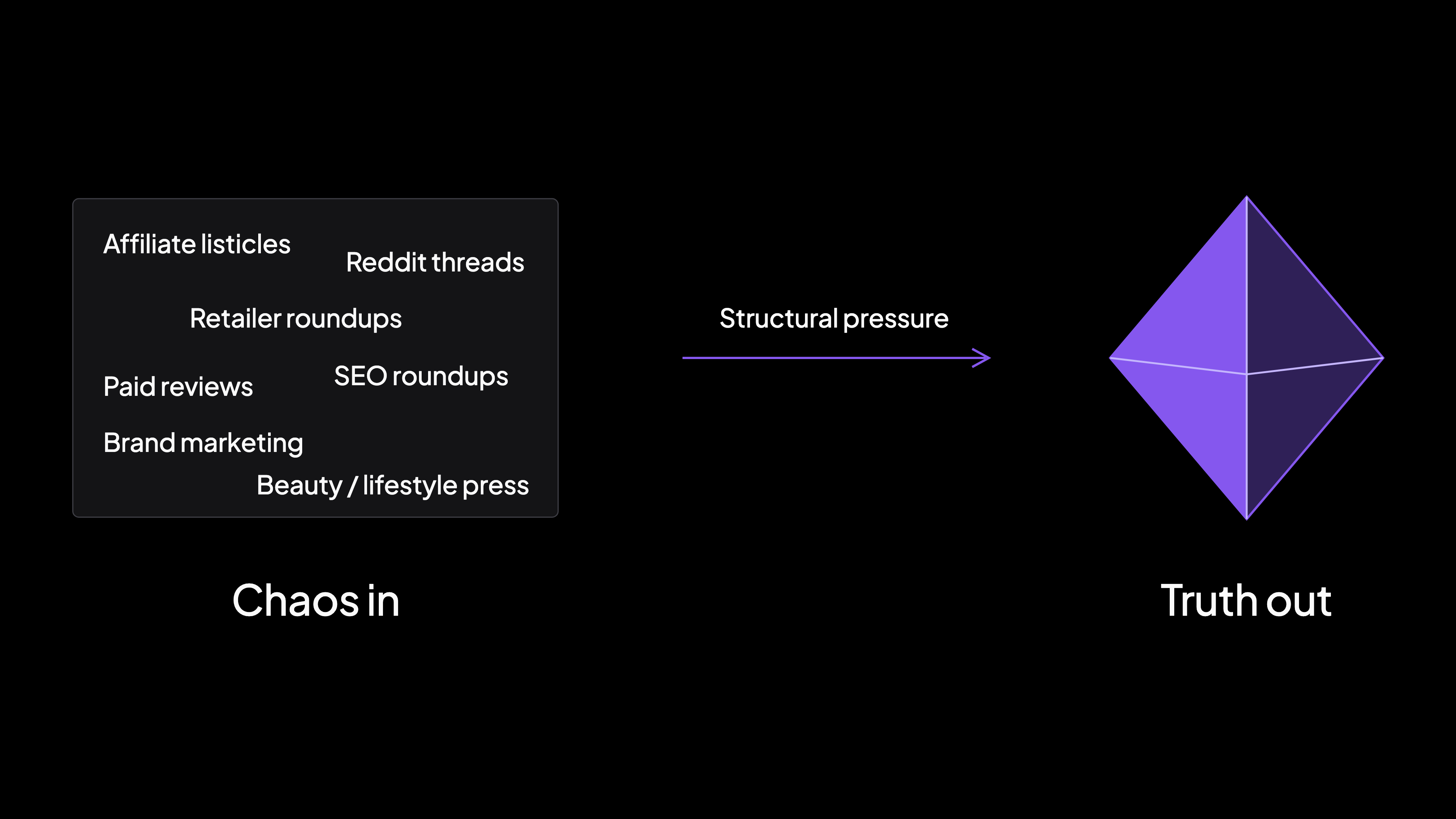
This gave me an idea for the logo. I believed it had to reference a diamond, because a diamond is just carbon put under immense pressure, and the truth is what happens when we take the collected knowledge of the internet and put it under structural pressure.
Chaos in, truth out. Structural pressure turns the noisy web into one forged artifact.
Axiom 4: Treatment determines category
This axiom emphasized that the right concept executed incorrectly can end up conveying the wrong concept altogether.
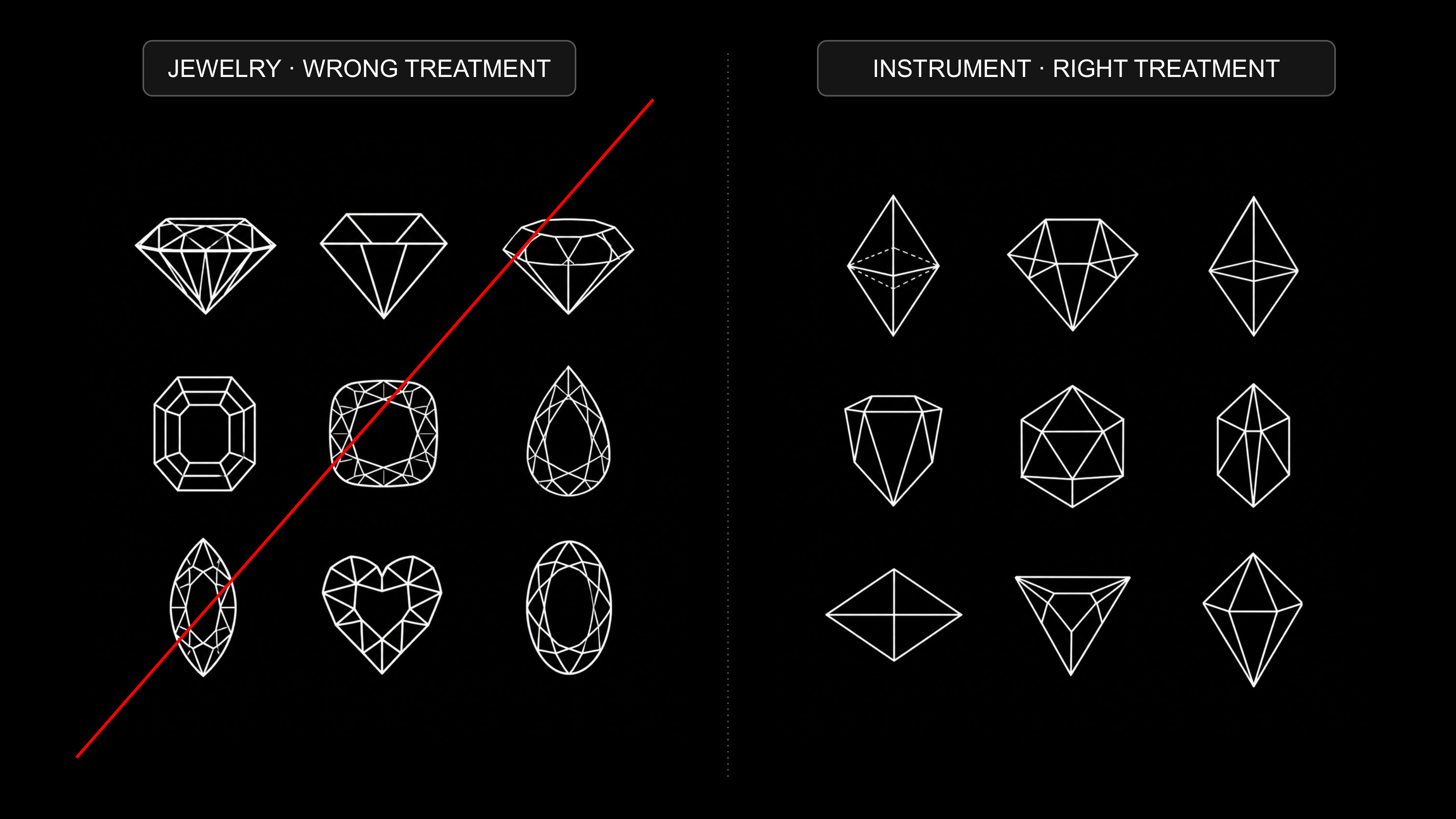
And I applied that lesson to my diamond idea. If we rendered the logo with sparkles, or in the wrong cut, it would instantly look like jewelry instead of an instrument. So we had to stay away from gemstone representations of a diamond and lean into something more structural.
Slide 74 from my Golden Hour 003 keynote: nine gemstone cuts struck through on the left, nine structural solids on the right. The same diamond idea reads as jewelry in one treatment and as an instrument in the other.
So I got to work.
Phase 04: I drew hundreds of diamonds and found an octahedron.
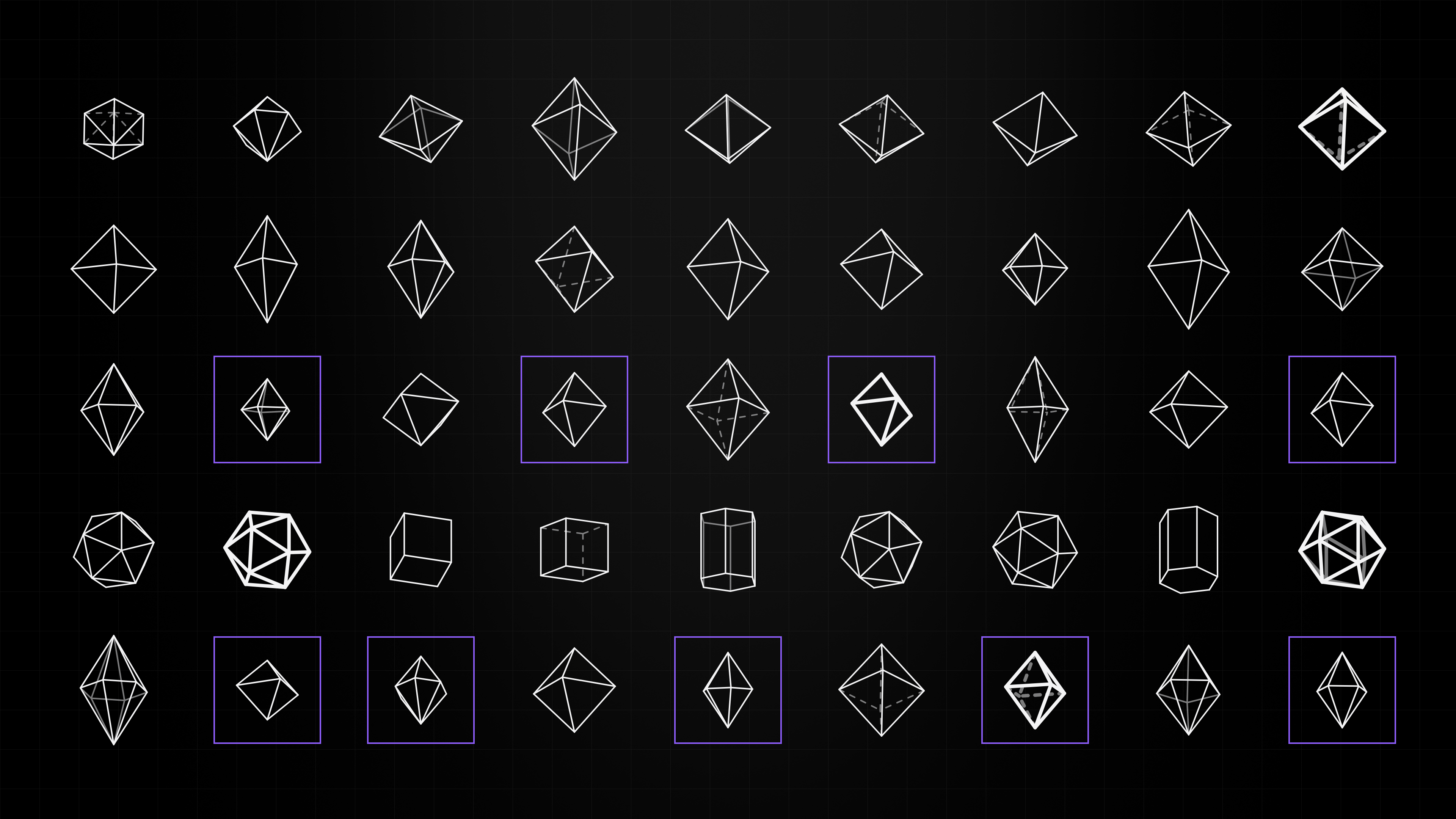
I drew hundreds of diamonds, in different cuts, from different angles, at different levels of complexity. After hours of work, I kept coming back to one shape, and I needed to understand what it was. It had been a while since high school geometry, so I had to look it up.
It was an octahedron. Eight faces, six vertices, balanced from every angle. It is one of the most stable forms in geometry. No front, no back, just structure.
A rendered sheet of the cuts and solids I worked through on the way to the octahedron, with the octahedron family boxed in violet.
A journey into octahedron lore
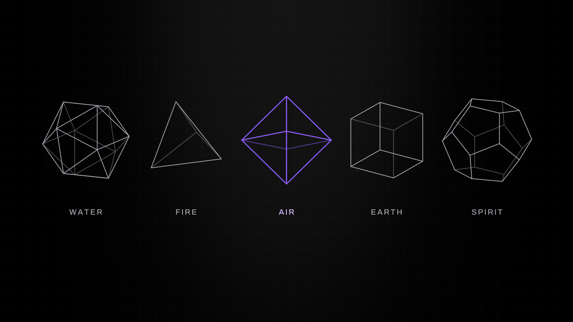
And this is where it got interesting. I went down the rabbit hole on the octahedron and found out it isn't just a shape. It has a history. Plato believed the entire universe was built from five perfect shapes, the Platonic solids, and he assigned an element to each one. The icosahedron is water. The tetrahedron is fire. The cube is earth. The dodecahedron is spirit. And the octahedron? That's air.
I remembered the brief, which was to build a visible structure for something intangible. Like air, truth is an element with no shape, no face and no color. The octahedron gave it a body.
Plato's five solids and the element he gave each one. The octahedron, drawn last, is air.
Making the final decision
At that point I was 99 percent sure about the octahedron. Then I learned one more thing that took me to 100.
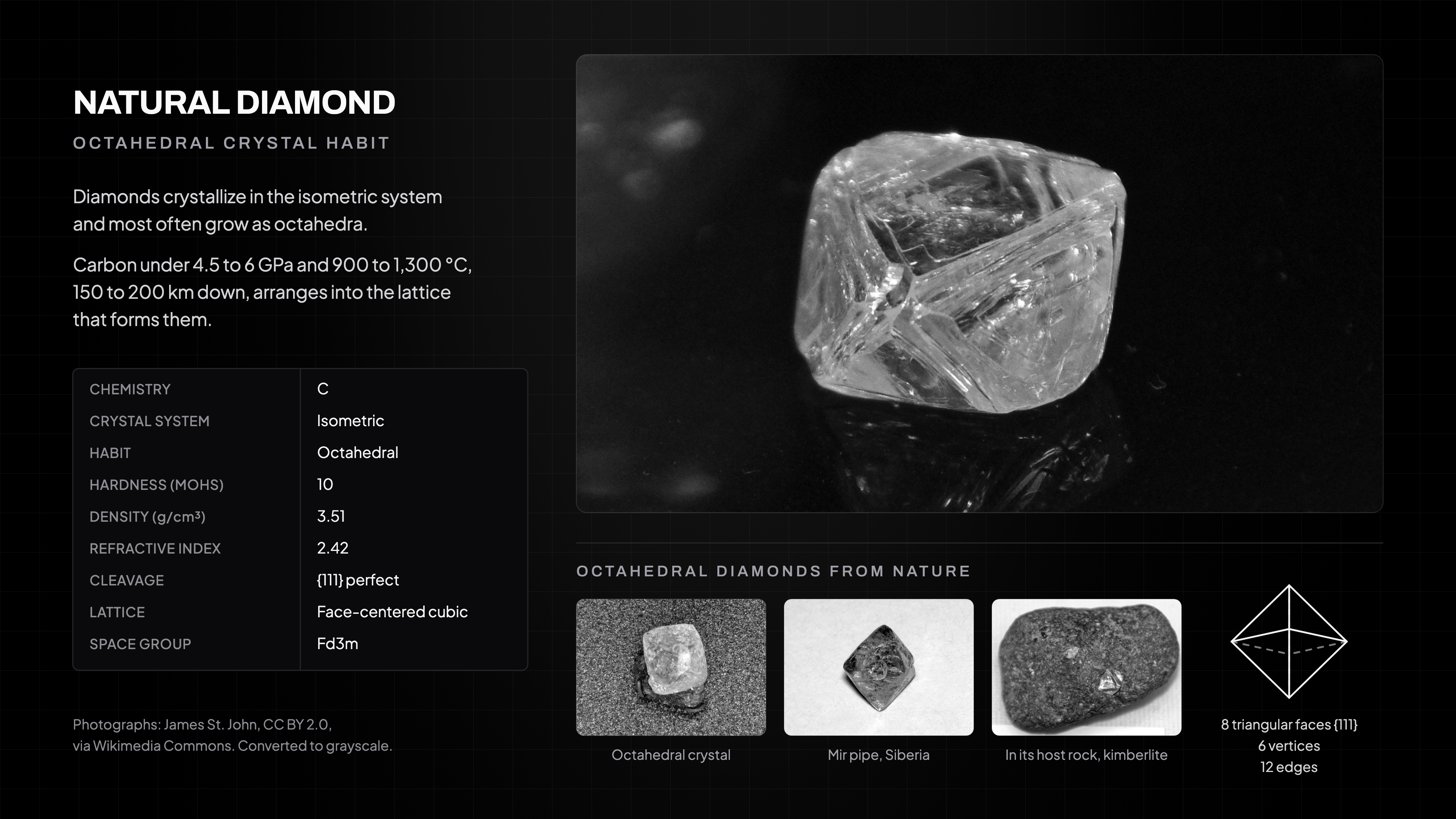
Before a diamond is cut or polished, it has a natural shape. That shape is an octahedron. The form we kept coming back to wasn't a picture of a diamond. It is literally how diamonds are forged.
Mind = blown.
Before anyone cuts it, a natural diamond grows as an octahedron: eight triangular faces, six vertices, twelve edges. Photographs by James St. John, CC BY 2.0.
We didn't find a metaphor. We found the form. Every dot connected at once. The brief said give the invisible a body. The axioms said forge, don't find. Plato said the octahedron is air. And the earth makes its diamonds in the same shape. Our logo had no choice but to be an octahedron. It almost felt like the universe handed it to us.
Phase 05: I refined the logo design to serve five meanings.
We weren't done. There was one more axiom, and it was about what the mark had to do now that we had the form.
Axiom 5: The mark is the system
This axiom said that a logo is a seed, and everything the brand makes grows from it. If the mark only has one meaning, you're restricting the story from the start. Pack in more meanings and you get a deeper well to draw from, a richer narrative and more room to grow. And those meanings don't have to be obvious. They can be built in for the team rather than the audience.
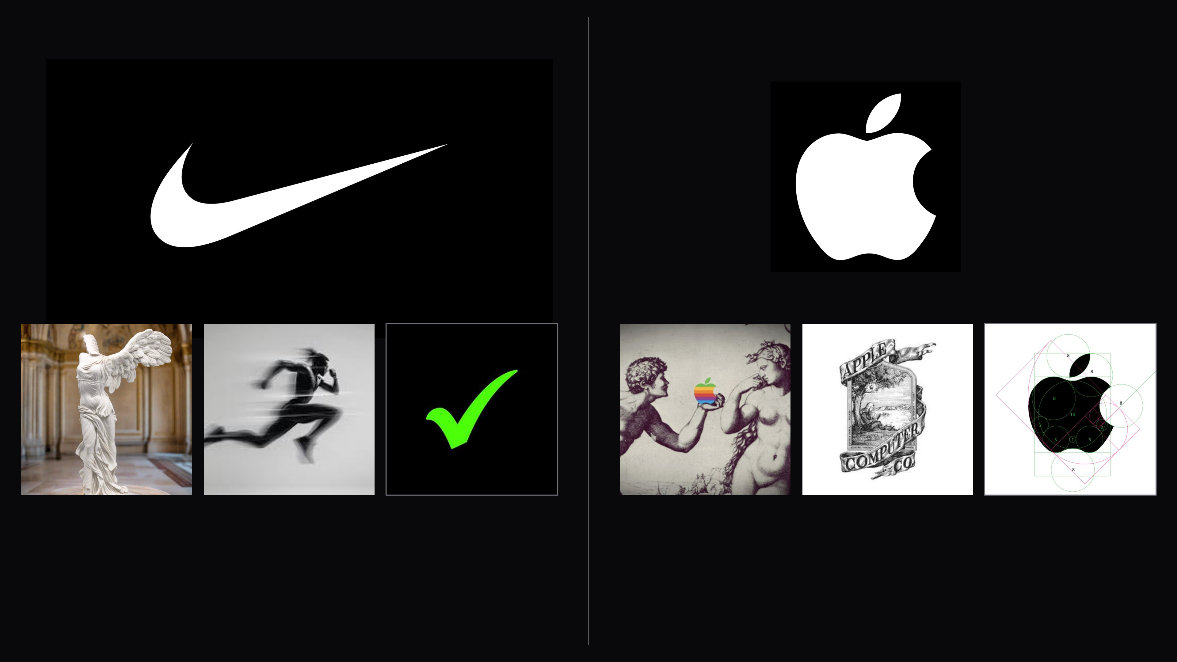
The research behind this axiom included the history of the Nike swoosh, which looks like a single mark but has three meanings. The designer drew it in 1971 to represent the wing of the goddess Nike, and over the years culture stacked forward motion and the checkmark of "Just Do It" on top of it.
Apple is even denser. Knowledge, from the fruit in Eden. Discovery, from Newton's apple, which also pays homage to the company's original logo of Newton under a tree. And simplicity, one silhouette and one bite that capture Apple's design philosophy.
Each of those marks has three wells to draw from. Not to brag, but ours has five.
Slide 82 from my Golden Hour 003 keynote: two marks and the three meanings each one draws on. The Nike swoosh carries the wing of the goddess Nike, forward motion and the checkmark of Just Do It. The Apple mark carries the fruit in Eden, Newton under his tree on the company's first logo, and the geometry of one simple silhouette.
One geometry, five roles
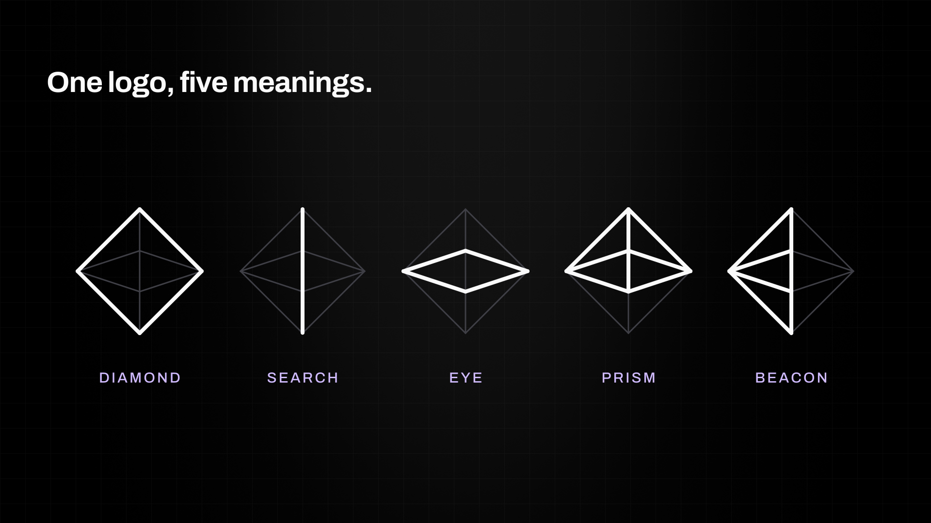
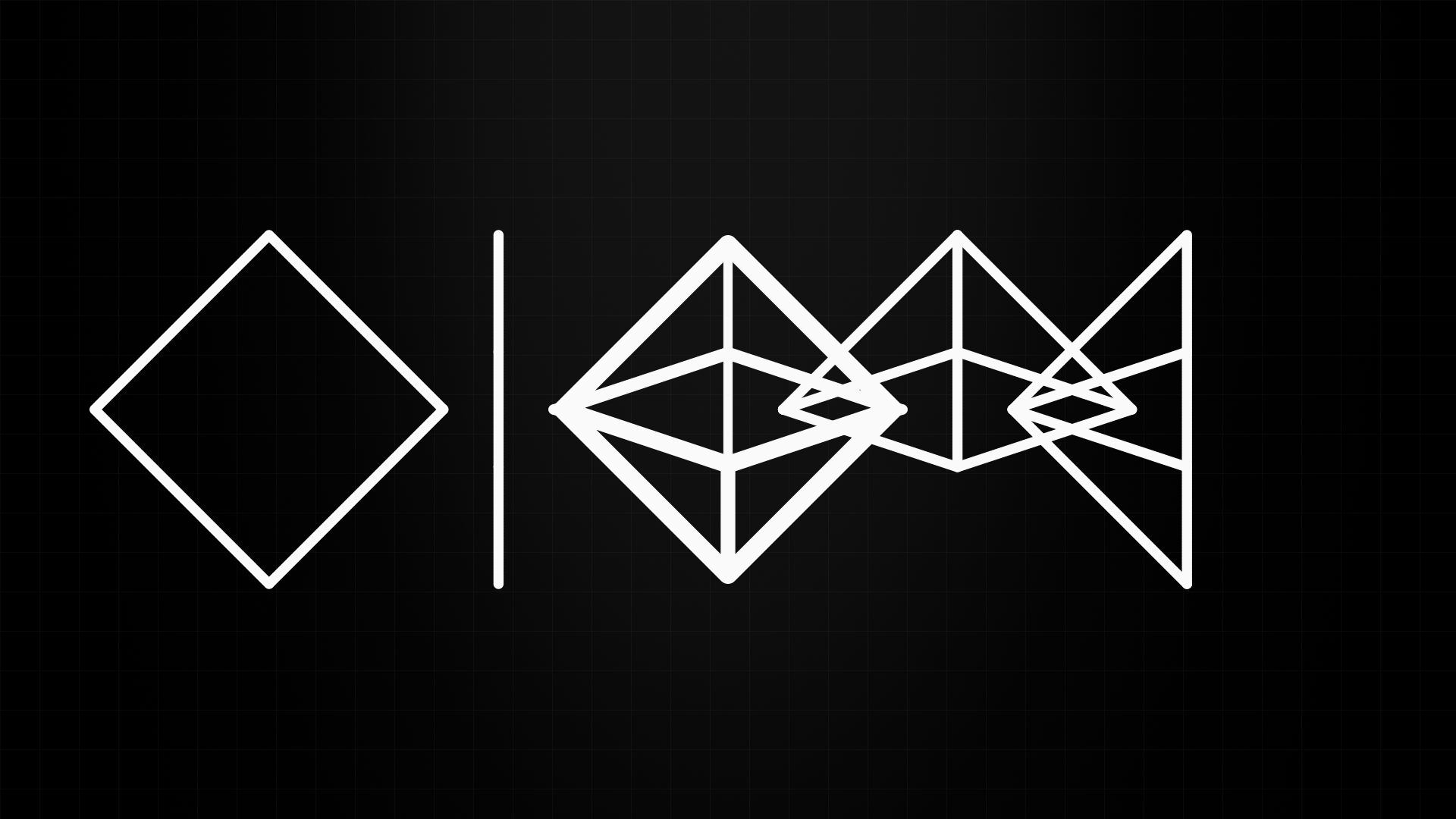
One logo, five meanings: the same octahedron reads as a diamond, a search line, an eye, a prism and a beacon.
The same octahedron is:
A diamond, forged truth made visible.
A search line, where the user begins.
An eye, implying verification from every direction.
A prism, separating signal from noise.
A beacon, a clear path through chaos.
These are five stories the brand gets to tell, forever.
Every decision after that, from stroke weight to proportion to orientation, had to work for all five at once. We could have made it flashier. We explored asymmetrical versions, versions with more depth, and versions with more flash. But tilt it, rotate it or push it in any direction and the layered meanings collapsed.
It only works this way.
Five meanings, one mark. Put them on top of one another and the octahedron is already there.
You've seen the logo already. Now you know why it couldn't have been anything else.
How AI enhanced my creative process
This was the first time I'd worked with AI on a rebrand of this size, and I went in skeptical. The axiom research let me compress the discovery phase and make fast decisions about our visual brand.
The axioms built the foundation and opened the door to the octahedron. It took years of creative experience, human aesthetic sense and the ability to connect the dots to walk through it. The axioms give you the structure. You have to find the meaning.
The brand meets the world
We locked the brand identity on February 9 and published brand.product.ai, our brand guidelines, on February 17.
The guidelines run on our own domain and in the brand they document, so the rules demonstrate themselves as you read them. The logo came first, and the type, the color and the rest of the system grew out of it. Since then the same octahedron has run on our website, in the product, on our investor and sales decks, at our Golden Hour events in Los Angeles, on social, out of home and on merchandise the team wears by choice.
In September, the brand won two MUSE Creative Awards, a Gold for Brand Guidelines and a Silver for Corporate Identity Redesign, in the same program as work for Google, Nike, and LEGO.
While I'm not sure where we'll go from here, I believe AI and axiomatic intelligence can help us reach creative goals faster, as long as we think critically about the recommendations they bring and aren't afraid to ignore them altogether.
I could not have gotten to the octahedron by myself, and the axioms could not have gotten there without me. The next thing we design will start the same way, with a stream of consciousness, two sessions with different instructions, and axioms that point the way but never decide.
Cite This Research
BibTeX
@misc{guzman-brand-in-2026,
  title    = {The first time I designed a logo with AI, axioms, and my own creativity.},
  author   = {Guzman, David},
  note     = {Practitioner account published by Product.ai Research},
  howpublished = {\url{https://product.ai/research/brand-in-42-days/}},
  year     = {2026},
  month    = {10}
}
APA
Guzman, D. (2026, October 22). The first time I designed a logo with AI, axioms, and my own creativity. [Practitioner account]. Product.ai Research. https://product.ai/research/brand-in-42-days/
MLA
Guzman, David. "The first time I designed a logo with AI, axioms, and my own creativity." Product.ai Research, 22 Oct. 2026, product.ai/research/brand-in-42-days/.
D
David Guzman
Creative Director
David Guzman is Product.ai's Creative Director, leading design end to end: concept, art direction, and execution across every surface. A 16-year designer and art director with roots at three Los Angeles agencies, Omelet, NVE Experience, and Hello Party, he operates as a one-person creative agency powered by AI across concept, image, motion, and code. He is the brand designer of record on the SimplyCodes rebrand, which won eight awards across MUSE, NYX, and VEGA, and he built brand.product.ai, a full brand guidelines site, unprompted.
{
  "@context": "https://schema.org",
  "@graph": [
    {
      "@id": "https://product.ai/#organization"
    },
    {
      "@type": "SoftwareApplication",
      "@id": "https://product.ai/#application",
      "name": "Product.ai",
      "slogan": "Intelligent guidance at conversation speed",
      "description": "Product.ai is your AI shopping expert - verified product intelligence grounded in the Truth Graph, accessible to agents and humans alike.",
      "applicationCategory": "ShoppingApplication",
      "operatingSystem": "Web",
      "author": {
        "@id": "https://product.ai/#organization"
      },
      "offers": {
        "@type": "Offer",
        "price": "0",
        "priceCurrency": "USD"
      }
    },
    {
      "@type": "ScholarlyArticle",
      "@id": "https://product.ai/research/brand-in-42-days/",
      "headline": "The first time I designed a logo with AI, axioms, and my own creativity.",
      "description": "How David Guzman designed the Product.ai logo by using the company's own axiomatic intelligence method. The work spanned two research sessions that ran independently, thirty axioms, one octahedron, and a lot of creative decision-making.",
      "url": "https://product.ai/research/brand-in-42-days/",
      "image": "https://product.ai/research/brand-in-42-days/assets/cover-social.jpg",
      "author": [
        {
          "@type": "Person",
          "name": "David Guzman"
        }
      ],
      "datePublished": "2026-10-22",
      "dateModified": "2026-10-22",
      "citation": [
        {
          "@type": "CreativeWork",
          "name": "BibTeX",
          "text": "@misc{guzman-brand-in-2026,\n  title    = {The first time I designed a logo with AI, axioms, and my own creativity.},\n  author   = {Guzman, David},\n  note     = {Practitioner account published by Product.ai Research},\n  howpublished = {\\url{https://product.ai/research/brand-in-42-days/}},\n  year     = {2026},\n  month    = {10}\n}"
        },
        {
          "@type": "CreativeWork",
          "name": "APA",
          "text": "Guzman, D. (2026, October 22). The first time I designed a logo with AI, axioms, and my own creativity. [Practitioner account]. Product.ai Research. https://product.ai/research/brand-in-42-days/"
        },
        {
          "@type": "CreativeWork",
          "name": "MLA",
          "text": "Guzman, David. \"The first time I designed a logo with AI, axioms, and my own creativity.\" Product.ai Research, 22 Oct. 2026, product.ai/research/brand-in-42-days/."
        }
      ],
      "publisher": {
        "@id": "https://product.ai/#organization"
      },
      "mainEntityOfPage": {
        "@id": "https://product.ai/research/brand-in-42-days/"
      },
      "inLanguage": "en-US",
      "isPartOf": {
        "@type": "CollectionPage",
        "@id": "https://product.ai/research/",
        "name": "Product.ai Research",
        "url": "https://product.ai/research/"
      }
    },
    {
      "@type": "BreadcrumbList",
      "itemListElement": [
        {
          "@type": "ListItem",
          "position": 1,
          "name": "Product.ai",
          "item": "https://product.ai"
        },
        {
          "@type": "ListItem",
          "position": 2,
          "name": "The first time I designed a logo with AI, axioms, and my own creativity.",
          "item": "https://product.ai/research/brand-in-42-days/"
        }
      ]
    }
  ]
}